The corporate identity of ZIO connects two organizations into one whole.
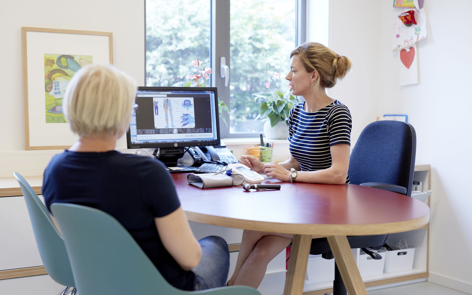
ZIO stands for 'Zorg In Ontwikkeling' (healthcare in development). An understatement, because if there is one sector where developments follow each other in rapid succession, it is healthcare. ZIO represents the interests of primary care in Maastricht and its surrounding region. They facilitate numerous issues and fulfill a coordinating and connecting role. Apart from ZIO, the Regionale Huisartsenzorg (Regional GP Care) is a separate organization specifically targeted at GP's in the region. Then came the decision to combine both organizations' forces in terms of communication, to come out with one voice. Therefore, the new corporate identity had to connect these two worlds harmoniously.
The challenge
Together with ZIO, we have successfully marketed quite some/a number of projects over the years. A selection of some:
Work out and design a new corporate identity for ZIO
Take care of an underlying document in which the brand strategy is clearly outlined.
Implement corporate identity in every facet.
Take care of ZIO's annual report each year for its stakeholders
Work out and design a corporate identity for 'Stadspoli,' a new initiative for more easily accessible and more effective healthcare that was developed together with the Maastricht University Medical Center (MUMC).
Create an online platform for GP practices with which they can easily make their own website. Every necessary standard feature is built into the platform.
Our solution


The feedback
““We have been working with R&R Communication for more than 10 years. We are very satisfied with their work and especially with their personal service. They listen and interpret well, really think along, and are proactive. They always know how to translate our requests into a creative product. that suits our wishes and their designed identity. “”